The logo concept visualizes the index and embodies our aim to continually expand the list of companies included.
It represents a flexible system that adjusts and grows, symbolizing constant movement and development.
This dynamic design reflects our commitment to fostering change and promoting continuous growth and progress.
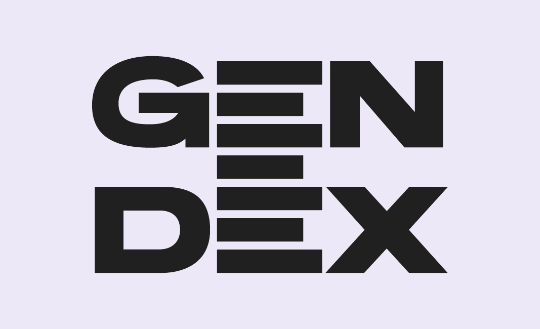
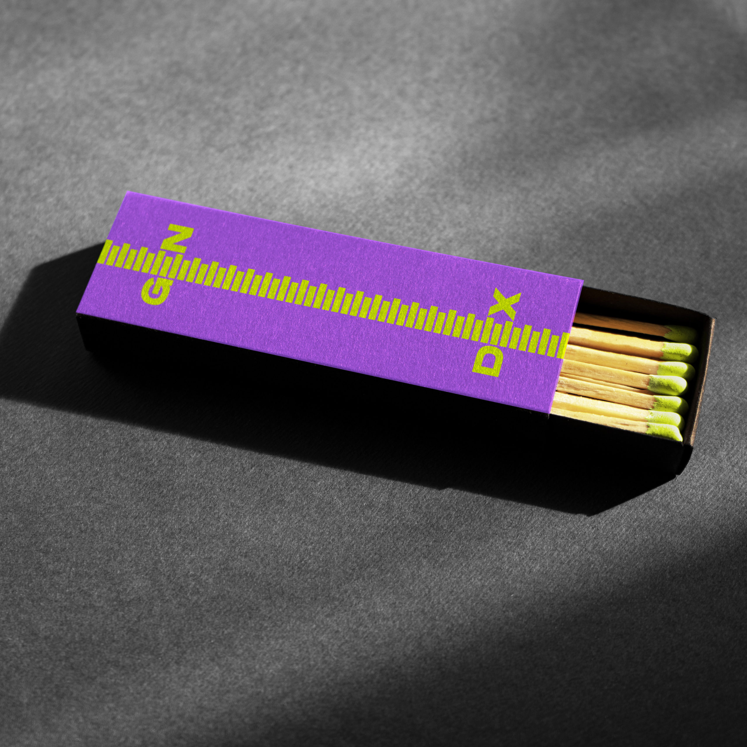
Logo system
The letters in the logo can move up and down along the index line: The G&N together, and the D&X. GENDEX is a platform creating space for diversity & inclusivity. The logo adapts this concept and is opening up for content and visuals, symbolizing the space for diversity and inclusivity.
Logo size
The logo can be resized as needed, provided there is always at least one bar between the edge of the artboard and the G&N and D&X. This design choice ensures the appearance of an infinite list, reinforcing our vision of continuous growth and inclusivity. The flexible and adaptive nature of the logo symbolizes our commitment to creating an ever-expanding space for diversity and innovation.
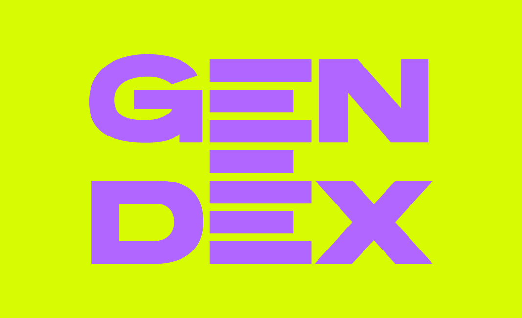
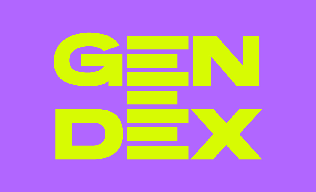
Recommended colour combinations
The brand colours are Lime and Purple. Those are often used in combination with each other when showcasing the logo.
Logo on image
Our logo can be applied in different ways when in combination with images.
The logo is big in the bottom on the image, without hiding any faces.
The logo appears in the top left corner.
The extended logo appears on the left side of the image.
An image appears on top of the extended logo placed in the middle.
Two images appear behind the extended logo that is placed in the middle.
The image appear on top of the extended logo placed in the left corner.
Safe space
To make sure the GENDEX logo is not crowded by other elements, it is important to keep a safe space area around the logo when placing it on certain layouts or media. The safe space is generated from the height of the letter „E“ of the word mark. No other elements like images, text or other logos should be placed within that safe space area.
The GENDEX logo has a different safe space distance when used on media where it is either the sole content or accompanied by a smaller tagline or sentence. In these cases, the safe space rule dictates that there should always be at least 1 bar between the logo and the edge or the short sentence. This rule applies to various contexts such as social media, merchandise, or business cards.
The extended GENDEX logo requires a different safe space distance to accommodate content emerging from the logo. To maintain visual balance and clarity, there should be at least 1 bar between the G&N and D&X and images, and at least 3 bars between the logo and any accompanying text or headline. This ensures that the logo remains prominent and legible while integrating with surrounding content.
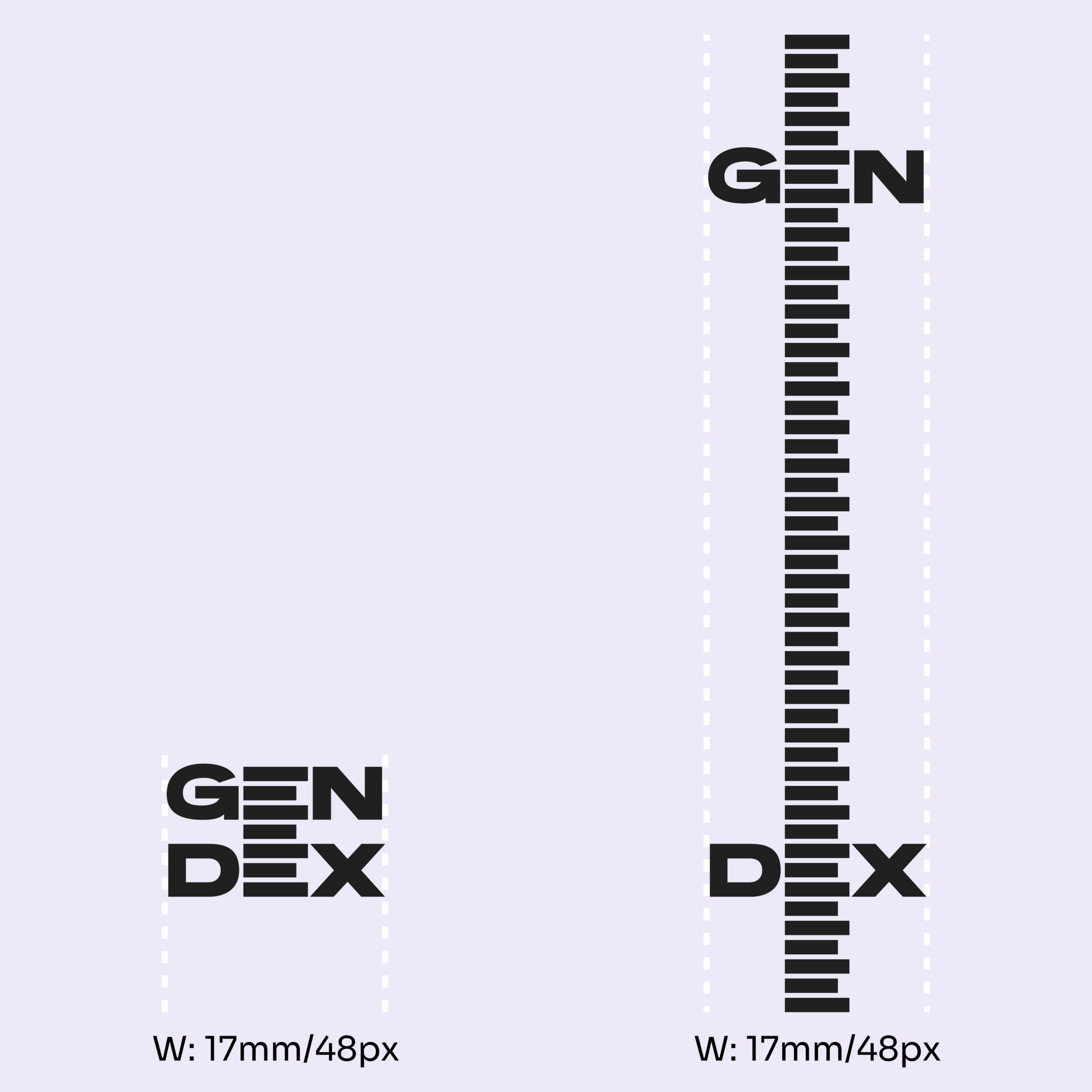
Minimum size
The logo has a minimum size of 17mm in width, extended or regular.
Logo Misuse
Do not make the index bars in the logo thinner.
Do not squeeze the logo.
Do not squeeze the logo.
Do not move the letters separately. If you move the letters along the bars, G&N and D&X always move as pairs.
Do not take out the bar between the two lines.
Do not change the length of the bars / do not make them equal.
Do not flip the bars. They should always stay Left aligned.
Do not change the order of the bars.
Do not stretch the bars or change their proportions.
Do not rotate the logo.
Do not apply any (3D) effects to the logo. We work with 2D only.
Do not mix colours in the logo. The logo should always be one colour.