Our typefaces reflect a commitment to professionalism and clarity. Given our brand’s emphasis on presenting clear, understandable facts, we prioritize readability and precision. Simultaneously, our typography captures the bold, impactful essence of Gendex, mirroring a brand that is both steadfast and dynamic.
Connection to Founderland
Gendex is an initiative under Founderland. To create a connection between the two, we have selected the same bold typeface for our logo and headlines. This choice strengthens the visual link between the brands, enhancing recognizability and ensuring our audience can easily identify and relate to both entities.
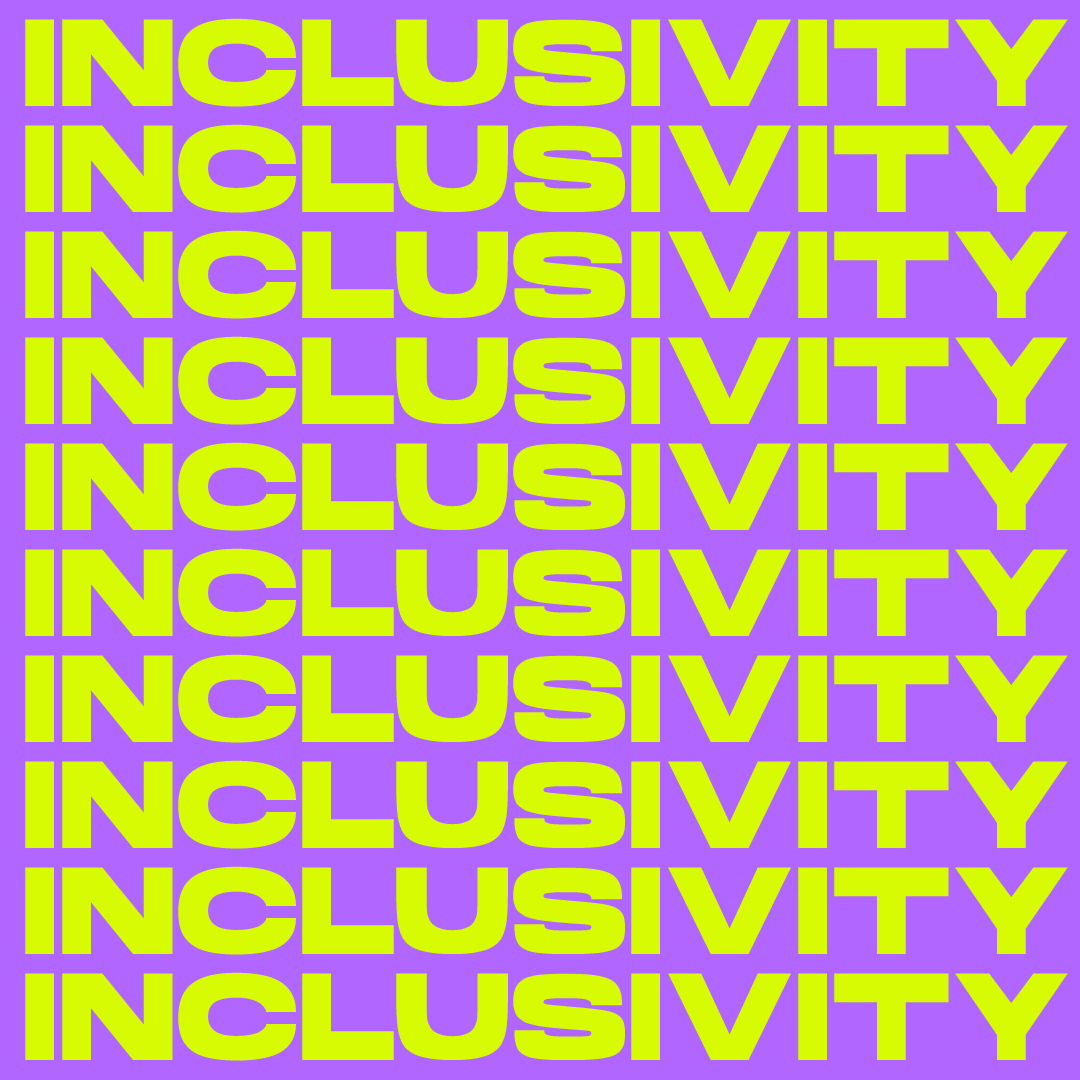
A bold type for bold messages
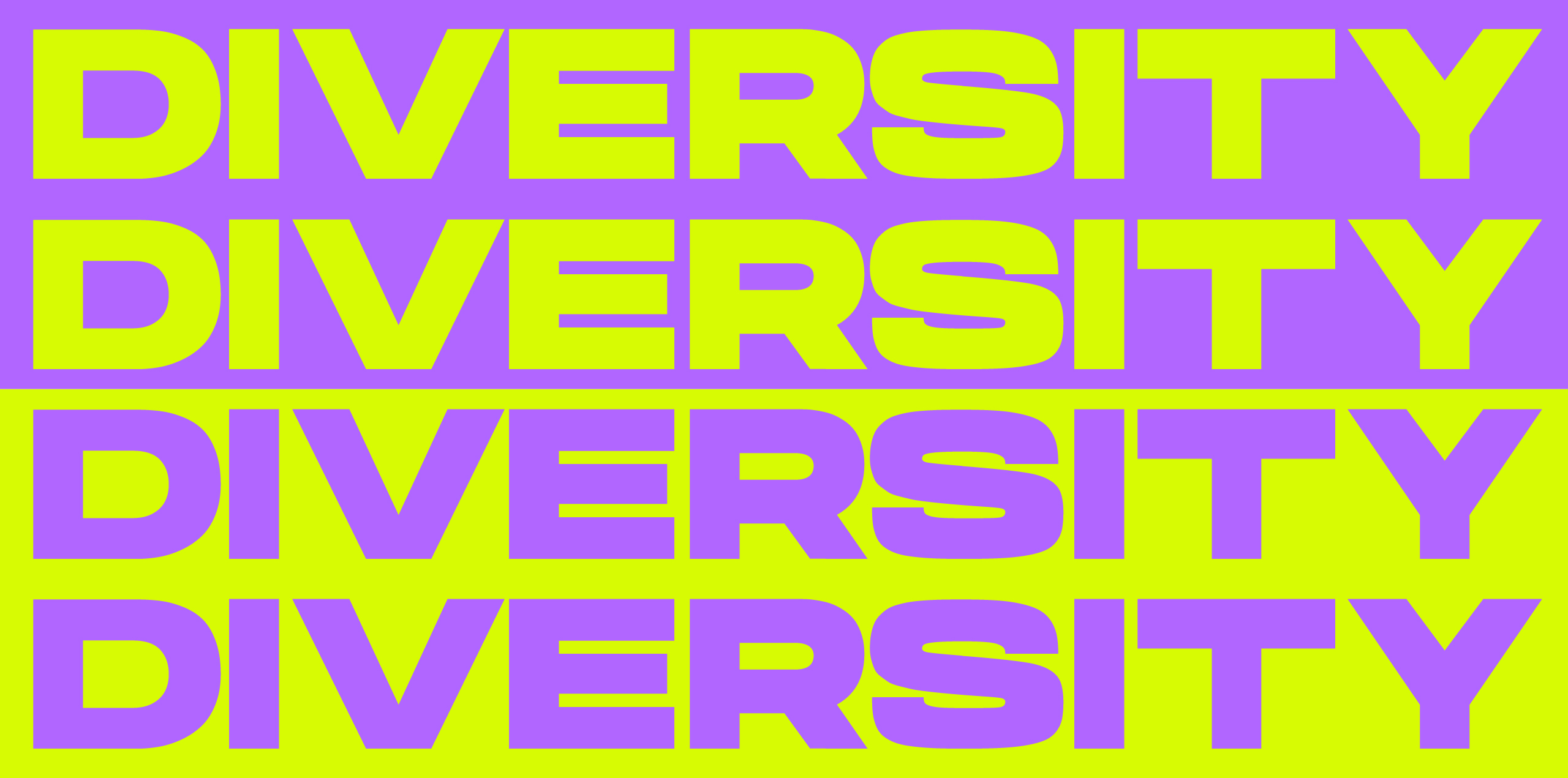
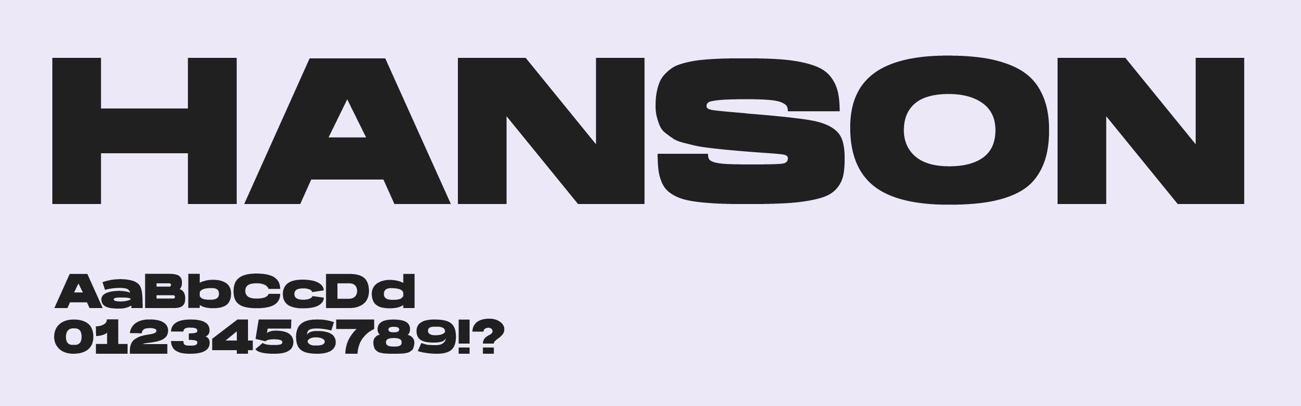
Gendex delivers bold messages, necessitating a typeface that mirrors this impact. 'Hanson' is the perfect match, as it takes up space and commands attention, effectively amplifying our message. By using 'Hanson', we ensure that our commitment to innovation, gender equality, and diversity is communicated with the strength and clarity it deserves.
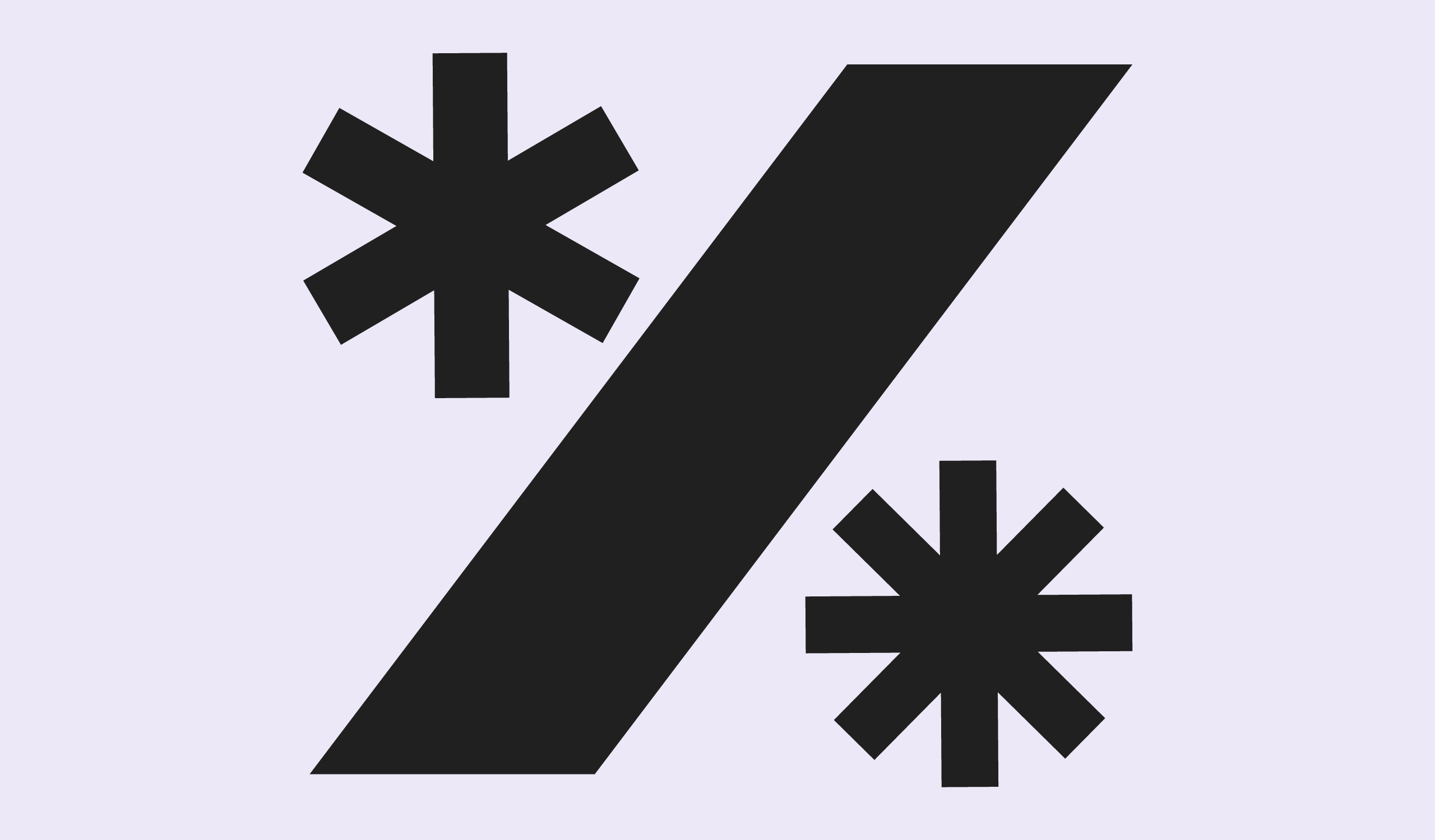
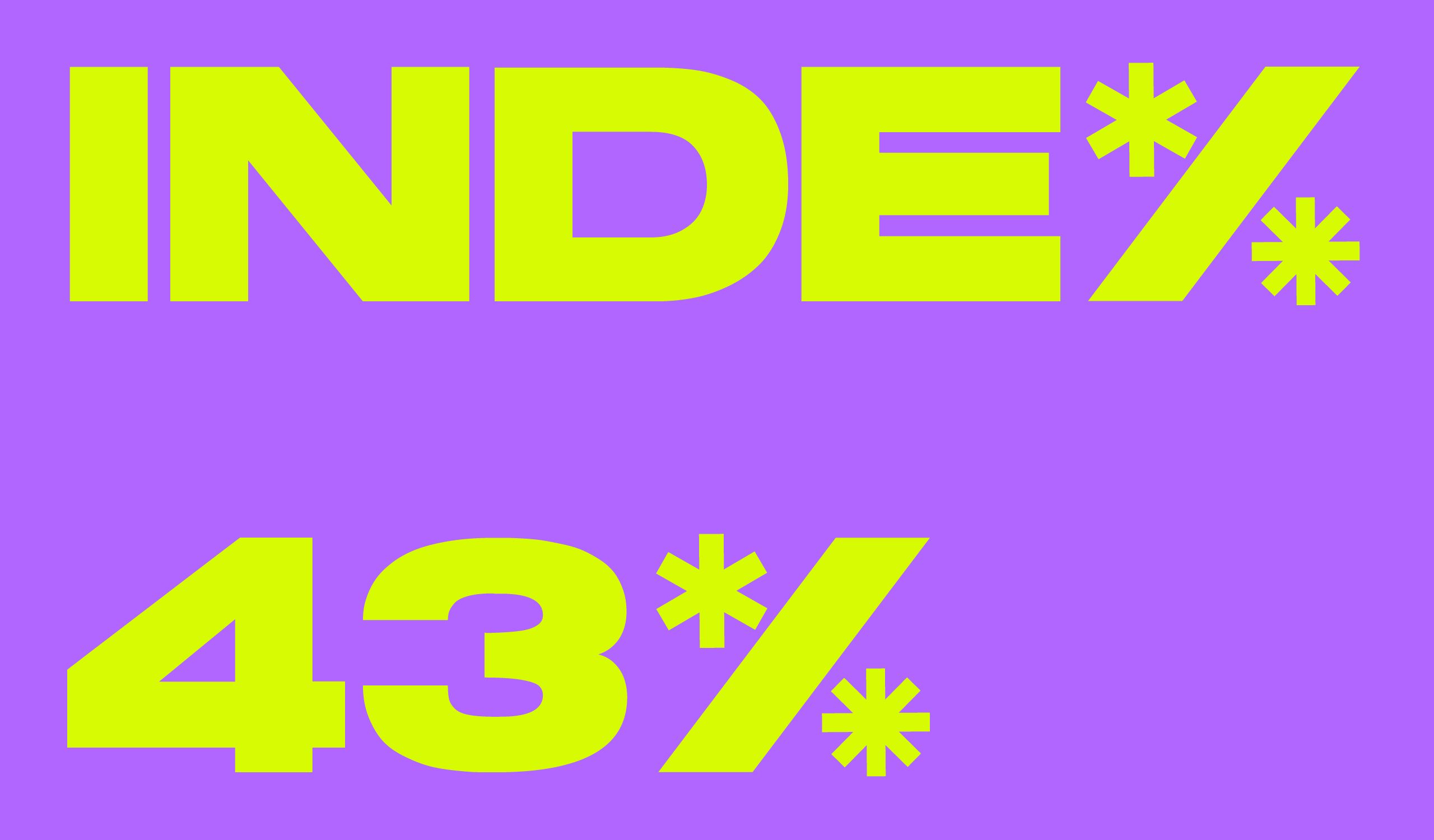
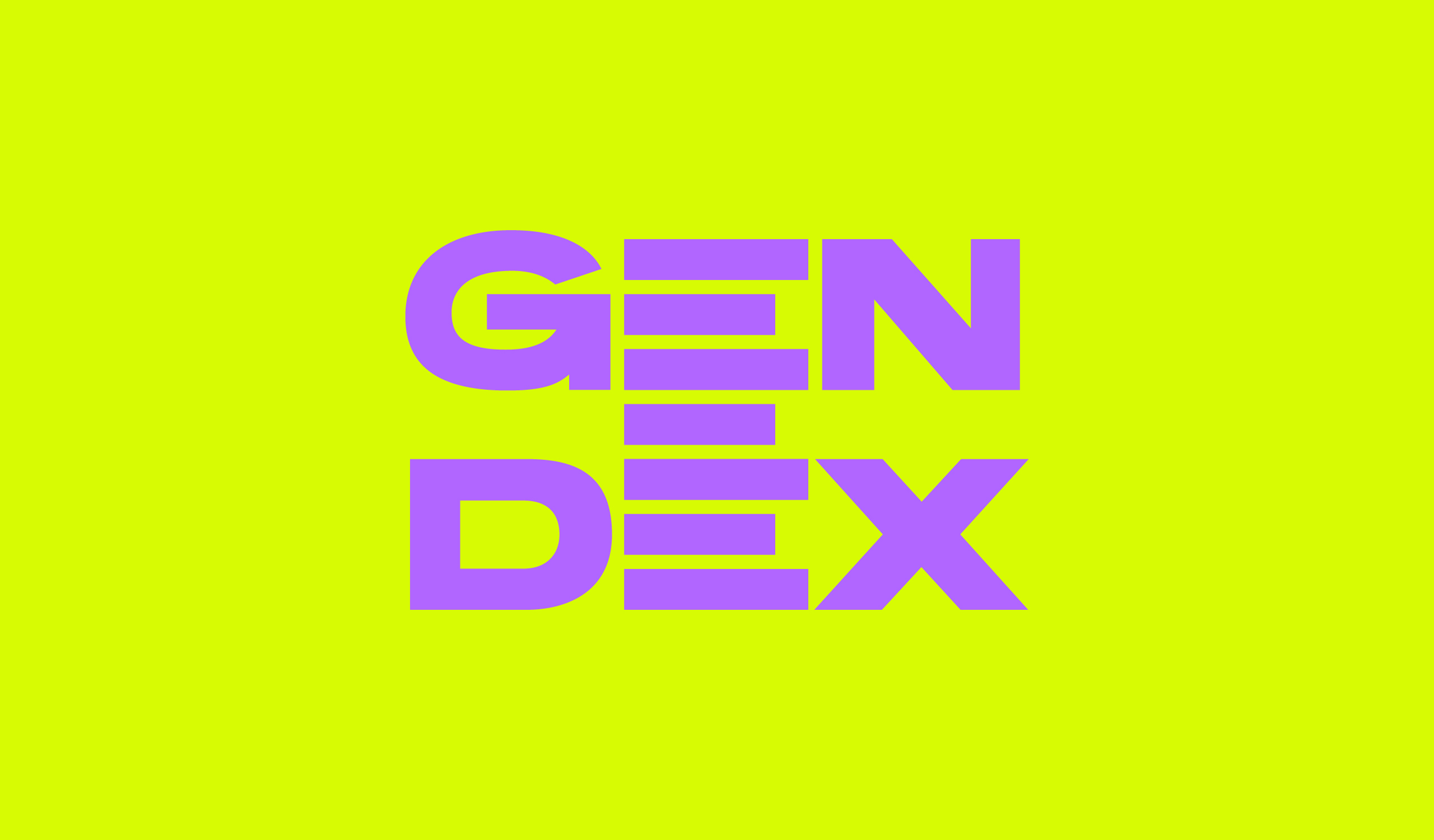
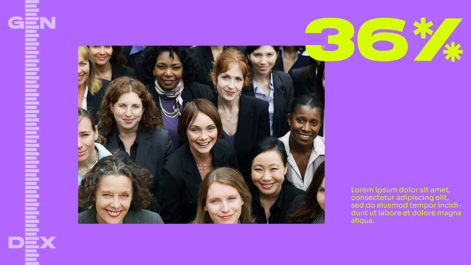
Percentage icon
The icon serves a dual purpose: it can display percentages and replace the 'x' in various words. It symbolizes our commitment to better data presentation, inclusion, and overall representation.
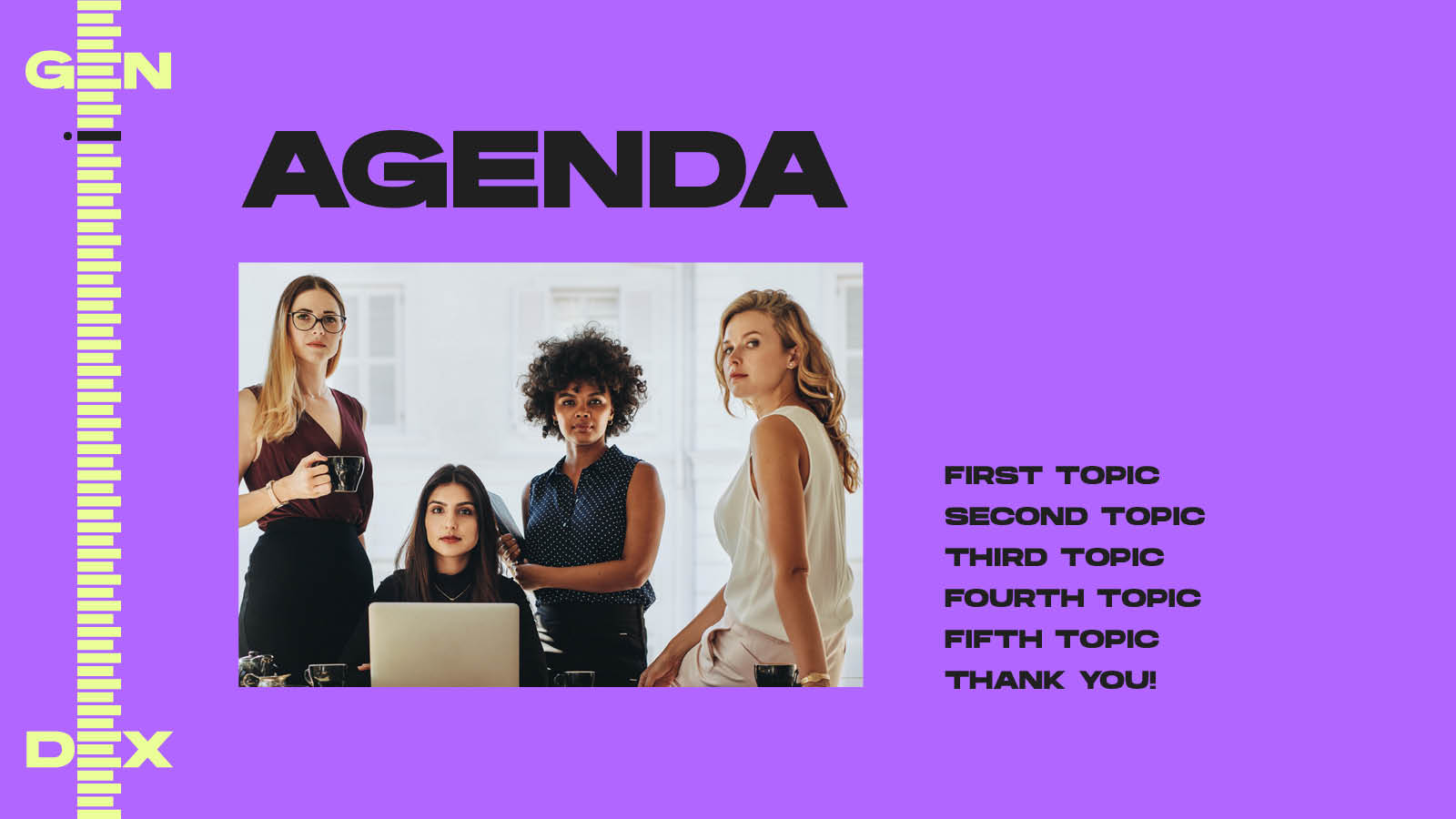
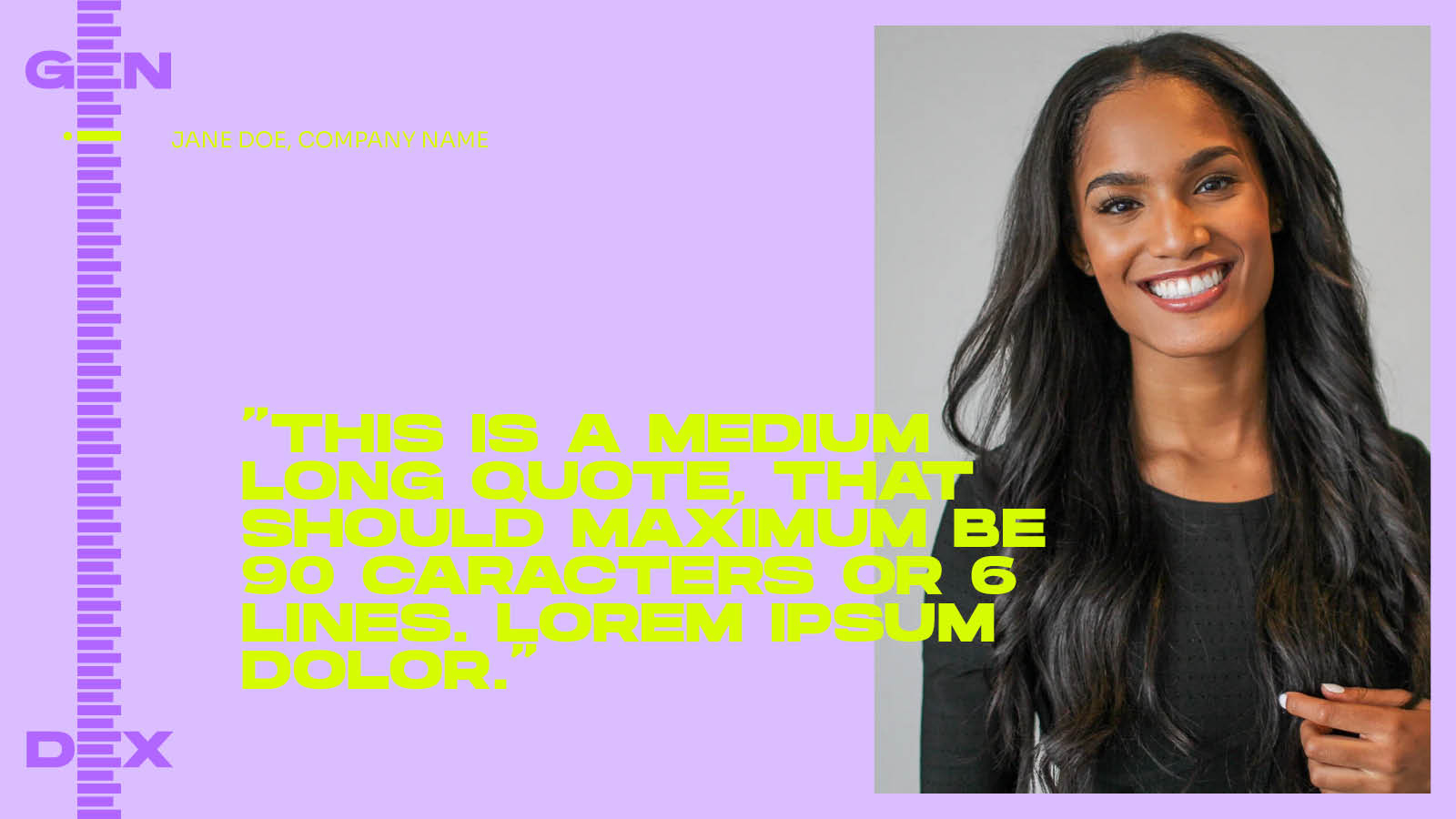
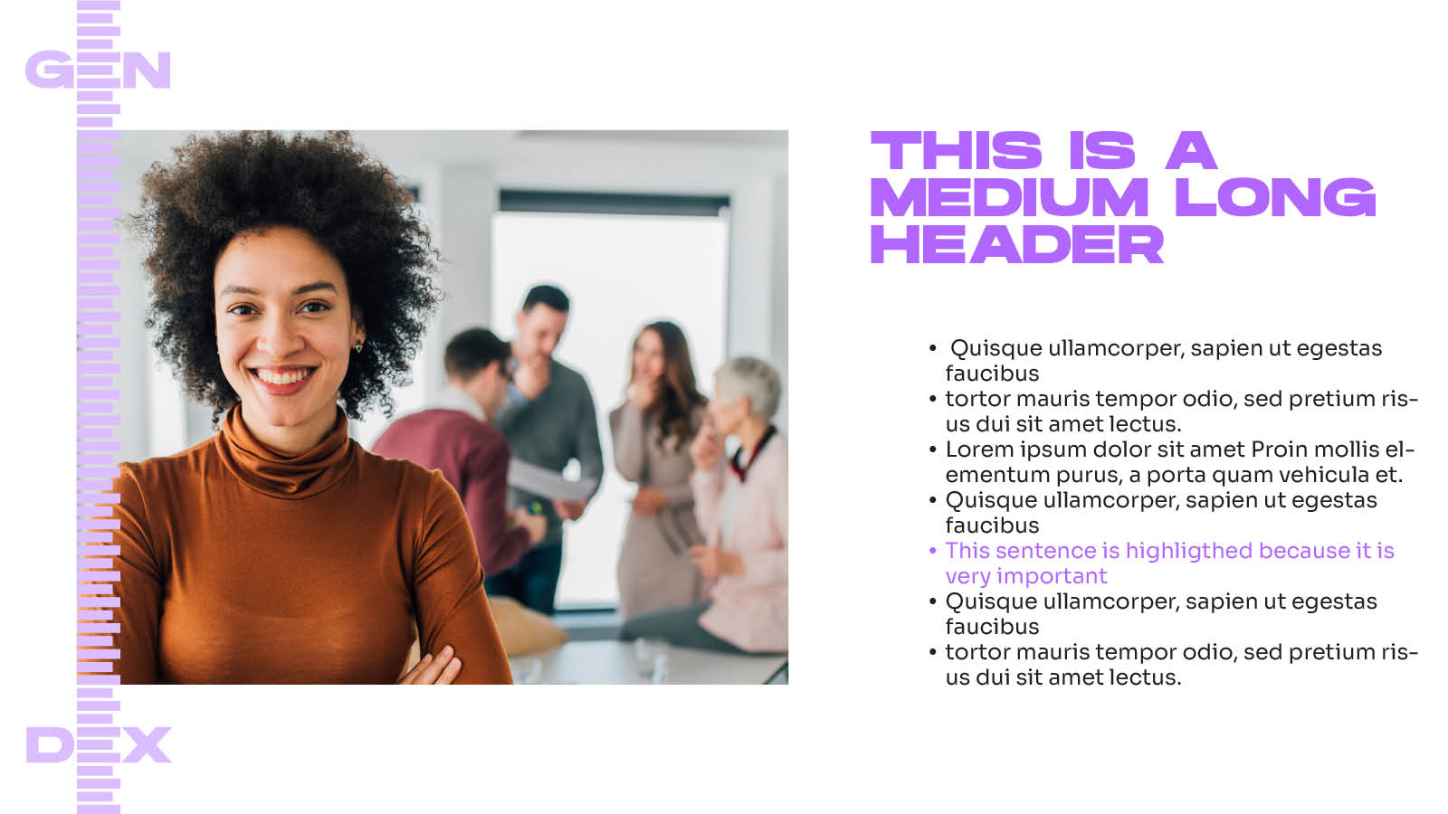
Hanson in use
Here is an example of 'Hanson' in use in the presentation template.
Typographic Hierarchy
All text is set to left align, and never justified with no exception.
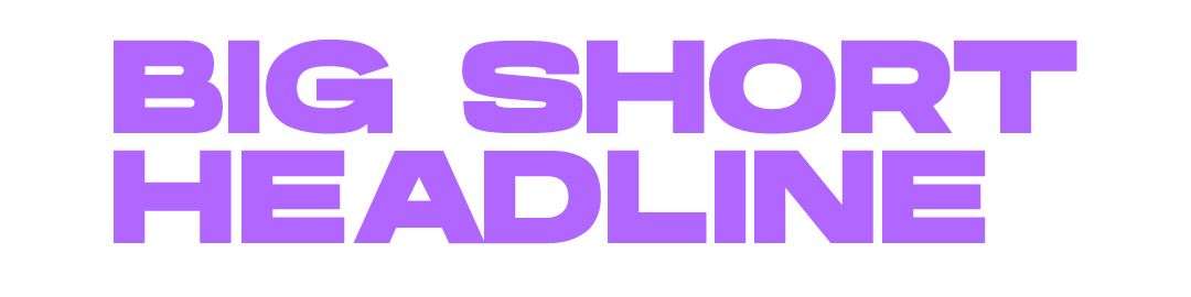
Hanson Bold – All caps
Used for short and medium long headlines.
Please try to keep them short and on point.
The line height is very small.
(we suggest upper case)
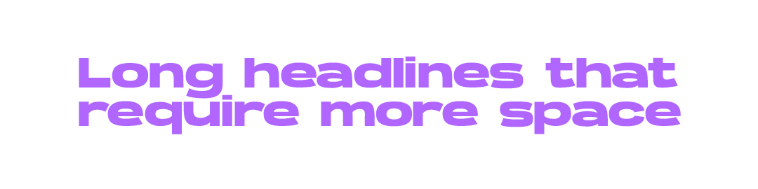
Hanson Bold – mixed
Used for long headlines, that require more space.
This is set in a smaller font size than Hanson in all caps
The line height is very small.
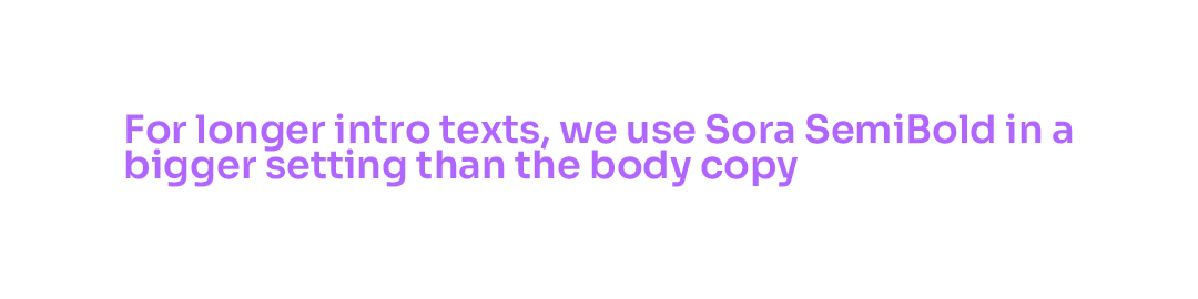
Sora SemiBold
Used for longer intro texts or subheadlines.
Sora SemiBold is always set in a smaller font size than Hanson, and a bigger font size than the body copy.
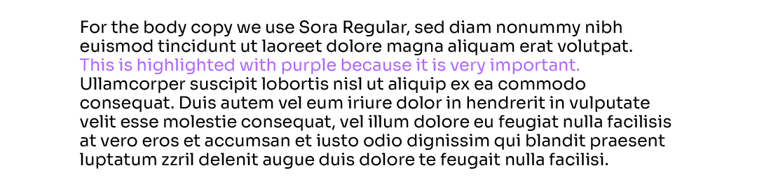
Sora Regular
Is used for body copy and bullets. We highlight with purple when we want to put emphasis on something.
Information heavy content
Headlines that appear along with additional text or information, has to be in the colour Purple on a white background.